For this project we were tasked with creating a playable
polished game within 8 weeks with the theme of ‘escape’. Unlike with other game
jams, we were instructed to make a game with a single level in mind, with us
only being able to work on further levels once the first level was finished to
a high standard. We choose our groups and started with brainstorming what kind
of game we could make to a high standard within the allotted time. As the
majority of my group were 2D artists, we decided a 2D game would be most
befitting as it would build to our strengths as well as letting us try new job
roles within making a game other then concept artist.
The basic narrative of our game was the player would play as
a blobfish (we choose this as we felt we could make a cute mascot out of the
character) running away from a sentient wall of tar that had taken over its
home; this not only would help with the escape theme but also but pressure on
the player as well (similarly to Super Mario levels where the left side of the
screen would be pushing the player forward). Now with a basic narrative, we
were able to divide up jobs and each work individually on aspects that we
needed but also be able to combine each day’s content into a final product.
 |
| Original Movement Mechanic |
CONCEPT ART – STRECH
As with all ideas however, a lot of iterations needed to be made before we could begin properly. We discussed the character itself, enemies the player would interact with as to not make the level stagnant with just the impending threat of the wall of tar, movement styles and other basic ideas. Originally we thought of having the Blobfish being able to stretch like rubber between platforms and sticking to surfaces (with inspiration for this being taken from the 2011 anime Hunter x Hunter), ultimately this was scrapped but we ended up keeping the ability to stick to walls as we thought this could be a fun mechanic the player could use during the traversal of levels.
MOODBOARDS AND COLOUR WHEEL?
As the members of the group discussed mechanics and how
these would be do-able inside UE4, the rest of the group discussed art styles
and other aesthetic concepts. After researching games such as Shovel Knight,
Fez and Kirby to be inspired, we decided on a rule that any colour used for a
character, enemy or asset would only have 3 colours maximum in that hue (with
very few exceptions). We did this as after looking into these different styles of pixel art we found Shovel Knight's use of colour would be much easier to do as we had no previous experience in a pixelated style. However we also found that Shovel Knight's art style was much harsher on the eyes in some of its areas. We found Fez's art style, as although unique to the games 2D/3D mechanic, was much softer and pleasant to look at at. We decided to combine aspects of both styles, using Shovel Knight's higher saturated look but also Fez's more softer approach of colour.
For example for the main character, if it were green, its main body, shadow and highlights would only use 3 shades of the colour green. In another instance, for a tar creature, 3 shades of purple would be used for the body, and 3 shades of orange would be used for the eyes. We choose this rule as to keep constancy of art styles between the 3 artists of the group and to also give the game its own unique style.
For example for the main character, if it were green, its main body, shadow and highlights would only use 3 shades of the colour green. In another instance, for a tar creature, 3 shades of purple would be used for the body, and 3 shades of orange would be used for the eyes. We choose this rule as to keep constancy of art styles between the 3 artists of the group and to also give the game its own unique style.


CREATURE CONCEPT
Now that all this was understood, that night we split into our respective roles and worked on what we could. In my case, I was the concept artist of the creatures in the game. I started by choosing a colour palette and began designing. During our meeting we had sketched a few rough designs, so I took those and digitalised them, adding iterations as I went.
I switched between working on characters and working on the wall of tar as a whole. For the creatures themselves I designed them thinking of how they would be used in the environment, for instances the non moving creatures would force the player to use the mechanic to stick to the ceiling, while the hanging creatures would do the opposite (1, 2 and 3). Other creatures however would force the player to act more directly. The Chomp ( 4,) would charge at the player, where on the other hand the Golem ( 5,) would me much slower but could take more hits.
I switched between working on characters and working on the wall of tar as a whole. For the creatures themselves I designed them thinking of how they would be used in the environment, for instances the non moving creatures would force the player to use the mechanic to stick to the ceiling, while the hanging creatures would do the opposite (1, 2 and 3). Other creatures however would force the player to act more directly. The Chomp ( 4,) would charge at the player, where on the other hand the Golem ( 5,) would me much slower but could take more hits.
 |
| Tar Creature Concepts (1-6) |
After handing over the concept design for the creatures to my colleague to pixelate and animate, questions arose about mechanics of each creature. While most of these could be explained through discussion, the Golem ( 5,) was causing issues as to how it would move. I decided to draw up a movement sheet showing how the creature would walk and attack the player to make it easier to explain.
 |
| Golem Movement Sheet |
FRONT OF THE WALL FRAMES
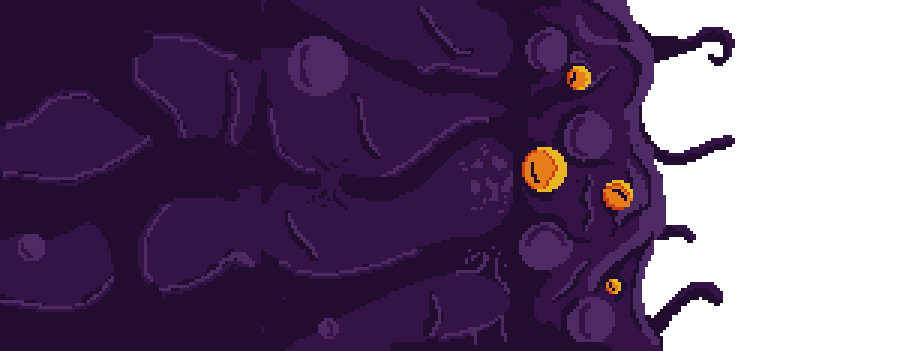
Once the concept of the creatures was finished I handed them off to my colleague to pixelate and animated them. As I had given him 4 concepts to pixelate I decided to work on the wall, as it would take much more time. When designing the wall I knew the front would need the most amount of detail as it would be the part the player would see the most of. I went through a few different designs, thinking of how they could be animated. I ultimately went with the tentacle styled wall as I thought having all the tentacles seething and moving would seem pretty intimidating to the player.
My original idea was to have the wall look as if its trying to reach out and grab the player as it's moving across the ground. However when trying to figure out how the animation of that, the wall and all the other movements happening simultaneously would be difficult to code within the game engine. Ultimately i decided to just have the wall look as if it was bubbling with the tentacles moving on a loop.
 |
| Tar Wall Concept |
My original idea was to have the wall look as if its trying to reach out and grab the player as it's moving across the ground. However when trying to figure out how the animation of that, the wall and all the other movements happening simultaneously would be difficult to code within the game engine. Ultimately i decided to just have the wall look as if it was bubbling with the tentacles moving on a loop.
 |
| Tar Wall Movement Concept |
I took the concept design and began creating the front of the wall. This part would have more animation, as it would be the most visible part to the player. This introduced new skills to learn, as not only did I have to learn how to pixelate my concept design but also how to animate it. This process took a while but ultimately I was able to make the pixels loop seamlessly. However, after creating this I realised that as the wall would be moving across the screen the body of the wall would need to be able to be repeated without looking repetitive.
PROGRESSION OF THE WALL
Knowing this, I created a series of square bodies that would be placed one after the other. However, although I am happy with the final animation, creating this took a fair amount of trial and error, as each section of the wall had to be able to flow into one another. In hindsight I could have created the entire wall as once singular piece, as this may have been easier; but I feel that the animations look a lot more unique, as each section had a unique animation that combines together as a whole.
 |
| Tar Wall - Front Animation |
 |
| Tar Wall - Sprite Sheet |
 |
| Tar Wall - Stage 2 Animation |
 |
| Tar Wall - Stage 2 Sprite Sheet |
 |
| Tar Wall - Stage 3 Animation |
 |
| Tar Wall - Stage 3 Sprite Sheet |
 |
| Tar Wall - Stage 4 Animation |
 |
| Tar Wall - Stage 4 Sprite Sheet |
Once the wall was finished we loaded into the game to see
what it would look like. Unfortunately one of the game developers had resized
the document without telling us. Although this wasn’t a problem for the character
animations, I had originally decided the wall to fit a Photoshop document of
the same scale.
 |
| Tar Wall x10 |
WALL X10
Because of this, I then had to go back and either re-design
the entire wall or think of some other way to use the pre-existing wall. I
choose to duplicate the wall on top of itself and join up each frame between
them to make them look like one whole piece. It was regrettable that the
original design had to be changed to this one, and although its seems more
repetitive now, I feel like this also works as a way to make the wall seem like
a much bigger threat to the player.
WATCHERS
One this was all created, I decided that having 1 person do all the pixel art and animation would be to much work for them; I also found that although apprehensive about pixel art at first, after creating and animating the wall I found I rather enjoyed it. Myself and the other artist discussed colour palettes and styles as to not make our work to different from each other’s and began working on new animations and creatures within the game. Some of these where rather simple such as the ‘Watchers’ as rather then being an interactive enemy, it was to be more of an aesthetic animation to be placed in the scenery, which had either a stone or dirt colour base to have them be able to be placed on their respective materials.
 |
| Watchers Concept |
 |
| Stone Watcher - Animation |
| Stone Watcher - SpriteSheet |
 |
| Dirt Watchers - Animation |
| Dirt Watcher - Sprite Sheet |
STONE HANGER
As we wanted to maximise the amount of time we had, the other artist would also give me some of his pixelated animations and ask me to help with them. For example, during our design phase we thought of having different variants of enemies, imagining the tar picking up different materials that would give it different defence purposes. One of which was a stone variant of the creatures in the cave. We thought that some of the enemies would have these variants such as the hanger having stone mixed in with its tar; I was able to create a stone version by simply drawing the stone on top of the existing concept and combined this with the other artist’s rendition of the normal hanger to create a pixelated stone hanger.
From there it was simply a matter or taking each of the animations frame-by-frame and adding stone to them. While the process was tedious to go through each animations frame, it ultimately worked well in creating a new version of an enemy for the game that would also be familiar to the player.
 |
| Hanger (Stone Version) - Spawn Animation |
| Hanger (Stone Version) - Spawn Sprite Sheet |
 |
| Hanger (Stone Version) - Idle Animation |
| Hanger (Stone Version) - Idle Sprite Sheet |
 |
| Hanger (Stone Version) - Death Animation |
| Hanger (Stone Version) - Death Sprite Sheet |
A lot of the time during our work time I spent going back
and forth between concept art and pixel art. After the stone hanger variant we
decided to design a mini boss for the game. We did this as during this time,
because the rest of the group weren’t working as fast as the artists, we were
running out of things we could do. I decided to design the mini boss as if
after the game jam we wanted to continue with this game we would have plenty of
assets to use.
TARLIC CONCEPT ART
As the player would only have had only physical interactions with the tar creatures, I thought that some form of enemy with the ability to shoot projectiles at the player would work well for the games mechanics. We discussed various designs but ultimately thought of a plant-based form would work the best. Once I had finished the concept I brought the Blobfish into a new document for scale and turned the concept art into a pixelated version. I decided to make the now named ‘Tarlic’ out of stone to link with the variations the player would see throughout the game (these variations would have high life points then the previous tier of enemy).
 |
| Tarlic Concept - Stone and Crystal Version |
Now pixelated, we though of an even higher tier of enemy
which ended being the crystal tier (staying with the underground/cave theme); I
tired attempted a pixel version of the Tarlic but found that I couldn’t get the
crystals to look right in pixelated form. I talked to the other artist who said
he had an idea about how to do it and in the end gave him the design to finish.
SPAWNER CONCEPT ART.
SPAWNER CONCEPT ART.
Once the Tarlic was handed over I decided to design another mini boss, as we wanted to take the game as far as we could; as although we knew a lot of these concepts and designs wouldn’t make it into the submitted version of the game, as a group we planned to work on the project over the upcoming summer, so we thought creating new designs would be useful for the future.
After a while of brainstorming, we figured some kind of mini boss that could produce other smaller tar creatures would be fitting, as the player would need to deal with the main enemy as well as the smaller less intimidating creatures. As I liked the idea of the Hangers I decided the design the creature similarly as to hanging upside down (I also thought at this was a mini boss having it at least one tier higher then the normal tar monsters would be best fitting as the boss would need to tougher to beat). As another idea that was being discussed at the time was a Spider type boss, I thought of spider eggs and how that might add to the unsettling nature of the Spawner. After a few quick sketches however I knew this wouldn’t be enough so I decided to look into other animals to splice together with the existing idea.
 |
| Initial Concept - Spider Version |
 |
| Final Spawner Concept |
SPAWNER MOVEMENT SHEET
I eventually settled on a snake and used it as a base to design the Spawner. Once I had a final version I had to think of how the creature would move and interact with the player. As this was a mini boss I felt it would need a few more animations then just idle, death and attack. I imagined the egg attached to the ceiling was more like a sac that stored tar, which the Spawner would then spit onto the floor, which in turn would spawn tar creatures out of it.
 |
| Spawner Movement Sheet |
SPAWNER IDLE
Now that I had the design finished and its main form of attack, I need to pixelate the Spawner and begin creating its animations. I found now that I had practice to do so, pixelating my concept wasn’t as difficult as I first found it to be; the part I found difficult however was creating more organic and flowing animations rather then fairly static ones like previously.
As the creature had a head like a snake, I found making the body sway to be very difficult and challenging, as when using pixels I wasn’t able to rotate the image other then 90 degrees without losing detail. This made it very difficult to keep the each frame consistent.
 |
| Spawner - Idle Animation |
| Spawner - Idle Sprite Sheet |
SPAWNER ATTACK
As for other animations, these needed to be split into multiple sections. This was if the animation was all on a single page, some animations might fall too short or clip over the environment. However, if the animations were separate from each other, they could be played for as long as necessary without causing an issue. I used this concept for the main attack of the Spawner. In total the animation as a whole was split into 3 parts, with the Spawner producing the tar, the tar falling and then the tar impacting the ground. Using this process the animation to the player would look like a single animation, but once the animation would finish, the repeating falling tar animation could play indefinitely, until it would need to impact on the ground.
 |
| Spawner - Spit (Attack) Animation (Pt1) |
 |
| Spawner - Spit (Attack) Sprite Sheet (Pt1) |
 |
| Spawner - Falling Tar Animation (Pt2) |
 |
| Spawner - Falling Tar Sprite Sheet (Pt2) |
 |
| Spawner - Tar Impact Animation (Pt3) |
 |
| Spawner - Tar Impact Sprite Sheet (Pt3) |
Once that was dong, all that was left was the death of the creature, which was fairly simple as I could use the idle as a guide as to where the head would go. This was still difficult as I was still unable to rotate the pixels without losing detail but the process was much easier to do while using the idle as a template. However after reviewing the animation I realised it was as if time would just stop and the creature would lose its believability. Similarly to the 3 in 1 animation, I created a simple death idle animation of dripping tar that would be played on a loop as soon as the death animation ended, making it look as if it a single animation and the player wouldn’t lose their immersion.
 |
| Spawner - Death Animation (Pt1) |
 |
| Spawner - Death Sprite Sheet (Pt1) |
 |
| Spawner - Death Idle Animation (Pt2) |
 |
| Spawner - Death Idle Sprite Sheet (Pt2) |
POWER UPS
As the player could be killed by one touch I thought power
ups for the player would be make a good addition to the game to give the player
more ways of traversing levels as well as letting the player have more freedom
in how they would like to play. To begin this we discussed what kind of
different abilities the player should get as to not make the game to easy or to
difficult. Eventually we thought of placing collectables in the levels for the
player to use to spend on power ups (which the could purchase at the beginning
of each level). We also thought of having icons at the bottom of the screen so
that the player would know when they could use their abilities as well as a
slight insight into what they do (without spoiling it for the player). While
the icons were easy to create as well as animating them, I was realising that
our animations were becoming longer and more complicated then the initial ones.
This was good as it meant our work was improving but we couldn’t let it become
too complicated and lose time.
 |
| Split Attack Icon - Animation |
 |
| Split Attack Icon - Sprite Sheet |
CHARGE SHOT
The first power up we decided on was an attack that let the player shoot across a larger range. The player would charge up their attack before firing a triple shot attack that could hit multiple enemies. Once the attack would fire the icon would then start it’s animation and once finished, would allow the player to use the attack again. Although the timing of these could be changed in UE4 itself, we felt that an average wait time of around 4-7 seconds would work to not make the ability broken.
Similarly to the 3 in 1 animation for the Spawner, the animation needed for the now named “charge shot” would need to be broken down into individual parts, as the charge button could be held down for an indefinite amount of time (as only once the ability was charged and the button release would the attack start). As such the whole ability had multiple parts to its animation which when put together would become more seamless.
 |
| Split Attack Individual Animations |
 |
| Small Projectile - Animation |
 |
| Small Projectile - Sprite Sheet |
 |
| Medium Projectile - Animation |
 |
| Medium Projectile - Sprite Sheet |
 |
| Large Projectile - Animation |
 |
| Large Projectile - Sprite Sheet |
 |
| Projectile Split - Animation |
 |
| Projectile Split - Sprite Sheet |
 |
| Small Projectile Impact - Animation |
 |
| Small Projectile Impact - Sprite Sheet |
 |
| Large Projectile Impact - Animation |
 |
| Large Projectile Impact - Sprite Sheet |
The first part of the animation would be the charge up (which would be broken down into 3 parts). The beginning of the character reeling back and the end of the character launching the attack were fairly simple, as they would only need to be played once. The charging middle section of the animation however would need to be a repeating animation.
 |
| Split Attack Animation Concept |
 |
| Split Attack Concept Sprite Sheet |
As I wanted to make it as easy as possible for the developers of the game, the energy ball attack was also split into sections; that way the
attack could travel for as far as possible before playing the next animation
needed. The first animation after the launch was a repeating animation of the
projectile rotating; once it had travelled far enough the next animation would
play of the ball shrinking and then separating into 3 projectiles. From there
it was simply the case of making a large and small projectile animation similar
to the first attack, which could then travel as far as needed.
While initially I found this complicated and time consuming,
as each separate animation would need to flow seamlessly into the next, I
understood why having the animations broken up would be necessary as it would
not only make the game developers jobs much easier but also the attack would
look less repetitive to the player if the ‘split’ happened at different
distances from the player.
MACHINE SHOT
MACHINE SHOT
The second power up was also an attack, however this time letting the player shoot a machine gun type of attack for a few second. Similarly to first power up the animation was broken into sections, with this mainly being a couple of repeating animations placed other each other. The first was just a change in colour that would move across the characters body, which would then follow into the character opening its mouth. From there the only animations playing would first be the energy shot firing out the characters mouth and the other being the character being pushed back by a single pixel (just to add to the aesthetic). Since by this point I had already done a similar animation, this one was much similar to do as I knew how the make the whole animation seem much more seamless.
 |
| Rapid Fire Attack Animation Concept |
 |
| Rapid Fire Attack Concept Sprite Sheet |
SHIELD/DASH
SHIELD ICON
The final animation was slightly more difficult to achieve as initially we planned on making a shield for the player to be able to take more attack before dying. The icon itself was simple as it followed the same aesthetic as the others; however making the shield around the character is what I found most difficult. At first I thought about using slightly transparent pixels to give the illusion the Blobfish was in a bubble, however when rendered the pixels were at 100% opacity and the player couldn’t see the character. I tried using a single player of pixels as an outline however it also didn’t look right for the game. While I wanted to make it work there were other things that needed to be done as well so inevitably I had to place the shield concept into the project backlog and hope to work on it again another time.
 |
| Shield Icon Animation |
 |
| Shield Icon Sprite Sheet |
DASH ICON
Similarly on the dash power up, originally I was planning to have the character dash forward with some form of motion blur, giving the illusion the character was travelling a larger distance much faster. However when it came to creating the animation for the movement, the blur wouldn’t look right as well as seeming to bold for such a quick movement. Ultimately after discussing with the group we decided to change the power up into a simple movement speed upgrade, which would give the player more control rather then a quick step.
 |
| Dash Icon Animation |
| Dash Icon Animation |
HEALTH PICK UP
At this point most of the in game assets had been created, so I changed tactics to looking at what else the game would need. As the player would need lives to collect during the game I choose to take inspiration from the original draft, as the character was initially made out of slime I thought it would be best fitting the comedy of the game to image the live pick up to be slime in a jar. I created the pixel art and then animated the slime inside to make it look as if the slime was alive inside the jar.
 |
| Life Pickup Animation |
 |
| Life Pickup Sprite Sheet |
TRAILER
After reviewing the brief for the project I realised the game would also need some form of promotional material. I was originally going to produce a pixelated poster for the game but instead changed my mind and decided to create a short animated trailer. I felt this would work well as the viewer could get a glimpse into the kind of animations and artwork, as well as portraying the light heartedness of the game.
To begin I created the fore and background of the image and began animating. As this was a trailer I wanted to have more then just a single item moving on screen to add some complexity into the piece. The torch for example was a repeating animation which once created I could copy and paste onto each new frame. What I found most difficult about creating this much more complex animation was the keeping everything consistent while at the same time keeping the same level of detail. While creating the trailer I also found new tricks I could use such as giving the character move facial expressions or how I could use lighting. By using the dodge brush in Photoshop I could create an interesting circular lighting effect, which I figured would work well for other light sources later in the game. The complete trailer was 172 frames in length and took around 2 days to complete. Although I feel possibly another scene could have been added to show some of the game play, I’m happy with the end result and feel it could work well as a teaser for a much longer trailer.
 |
| Original Promotional Trailer Animation |
STARTSCREEN
For the start screen the group decided to use the end of the trailer as the start screen for the game where the player would choose to start the game, look at the controls, or even load later levels in the game if we could get to the stage of multiple levels. However after loading the original trailer to copy the end frames I realised that the clouds in the background had been lost and replicating them exactly would cause more hassle then simply starting again.
I also choose to start again as I felt that the sky line could be achieved better then using a simple gradient to achieve its depth. After a short amount of time I was able to create the skyline as well as creating the pixelated clouds that would float across the screen. The clouds took the most amount of time, as it was difficult to having them look soft and realistic without increasing the scale or adding too many different colours.
To begin the animation I moved the clouds a few pixels at a time over the numerous frames (making sure the distance the clouds moved each frame was the same to keep consistency). Once the clouds had done a complete loop I then took the amount of frames and divided them up to be able to make a second looping animation of the dripping tar; so if need be the complete animation could loop numerous times without there being an obviously jump as to when the loop finishes and restarts.
Now that I had understood how to create looping animations within animations, I was able to combine all the frames together and create the start screen, which would be playing while the player gets ready to start the game.
Now that I had understood how to create looping animations within animations, I was able to combine all the frames together and create the start screen, which would be playing while the player gets ready to start the game.
 |
| Start Screen Animation |
 |
| Start Screen Sprite Sheet |
NEW TRAILER
As I preferred this animation to the previous one at the end of the trailer, I also copied and pasted this to the end of the trailer so the viewer had more time to read the title and get a feel for the trailer, which brought the entire trailer to the game up to 215 frames.
 |
| Final Trailer Animation |
 |
| Final Trailer Sprite Sheet |
BUTTONS
I realised however that the start screen would need buttons for the player to press to access these functions on the start screen. I went through a few different designs, testing what would work best and would be to eye catching or too unnoticeable. Since I knew roughly where the buttons would go I was able to make a small rectangle and place it into a new document, and try out different materials and shapes.
I went with Dirt, Stone and Tar version of buttons as I felt these were the main 3 parts of the game. Once finished I also made identical versions but this time with the letters in a different colour; as so when the player hovers over the button they’ll know which one is selected before pressing the button. I used a more complex colour palette, as these needed more
detail, as these would be the first things the player would see when loading up
the game.
I tried to create my own pixelated text for the words on the
buttons, however the letters weren’t the consistent size or width and looked
out of place. I decided to use a font I found on Da.Font named VCR OSD Mono
Font by Riciery Leal (which was 100% free) and used it as a base to create the
words for the buttons.
 |
| Menu Button Variants |
 |
| Example of Buttons in Game |
UI
After reviewing what the game looked like so far during a
crit session, I realised that the health and gem collectables were shown as the
words lives and collectables. From that I decided to create icons to use to
represent the lives of the player and how many collectables they have found. To
do this I simply enlarged the original character, adding more shading since
this version of the character would need more detail to not appear flat. I also
did this with the collectable in game image one of the other artists had worked
on, enlarging his design and adding shading.
I used the same font as the letters to create consistency
between the numbers and the letters. Similarly to before, I used the fonts
numbers as base, and then adding small changed to keep the numbers the same
size and depth. The numbers I made for the counter went from 0 to 9 as if
needed the developers of the game could use multiple numbers to create double
digits. I felt this worked well as it would rather then having every number from
1 to 99 this process would save space. I also made so that in the case of the lives, when the player has more then 5 lives the icon would be happy, and once the players lives decrease, the mood of the characters face would also change; which I felt was a fitting aesthetic.
 |
| Life and Gem Icons with Counter |
To match the font from the buttons, I also made 'Paused' and 'Results' signs to go at on the pause menu and at the end of the level, counting the amount of gems found during the level.
 |
| Pause and Results UI |
OPTIONS
As with all games, the player would need to know what
controls to use to play. I decided to create a widget styled page the player
would see after pressing the options button. I took frames of each animation
needed and used them as icons to give the player a more visual representation
of each action. After this I made the font and created my own icons to show
which buttons would be needed to use each action. As the format for the game
would be an Xbox controller, I used the button colours to further link between
the icons and what the player would be holding.
 |
| Option Screen |
CONCLUSION
As a whole, this project has tested me much more then my
previous making of a game at the beginning of this year. Rather then creating
and programming everything, roles had to be set up so work could be completed
efficiently. I had to learn how to rely on others and trust in the fact works
would be completed on time. This indeed pushed my patience as on occasion
members of the group slacked or took their time to finish work on schedule.
While this is guilty of everyone, at the same time, everyone contributed to the
best of their ability. During this entire project I have learnt to create pixel
art, animate and think of animation sequences as multiple steps. Although
looking back at this project I feel that with the amount we created we could
have made much more, in the end I am happy with the final result. I feel that
some animations and pixel art could have been much more detailed or clean, that
is also only natural, as prior to my work in the beginning of this project, I had
no experience in this form of style. Being an artist of a game made me realise
there it is much more then just concept art, as within this project I was
responsible for the animations and UI.
Bibliography:
http://yachtclubgames.com/shovel-knight/
https://wwhttp://www.godisageek.com/reviews/shovel-knight-spectre-of-torment-review/w.nintendo.co.uk/Games/Wii-U-download-software/Shovel-Knight-858506.html
http://gematsu.com/2010/12/fez-gets-new-gameplay-video
http://kaidus.com/community/threads/fez.160/
http://www.gamesobscura.com/page/2
https://www.destructoid.com/fez-and-the-lost-art-of-taking-notes-226487.phtml