For this project we was tasked with creating a 5 minutes prototype of a game of our own choosing, with the only restriction being the game needed to have inference (telling the player information/exposition without telling the player everything, for example, item lore in Dark Souls telling the player about the world without sitting them down and explaining everything). We also needed to make a 2 page Sell Sheet, explaining the main themes of the game as well as trying to promote our game in some form of businesses situation. The final task within this project was to create the game with a minimum of 3 different mechanics.
Week 1:
Within this week I wanted to get as many ideas and
prototypes created. I used a random word generator and other sources such as
pre-existing games and other media to be inspired. My first main idea was to do
a reversal on the well-known Arthurian Myths, where the Knights of the Round
Table are the antagonists and the main character is a Blacksmith wanting
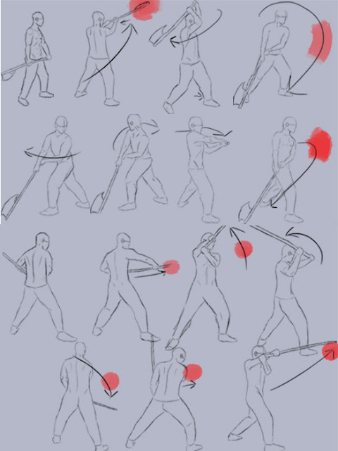
revenge. I created a few conceptual drawings showing some of the movement
within the game just to begin designing.
 |
| Primary Movement Sheet |
 |
| Primary Landscape |
 |
| Primary Landscape 2 |
I realised however while creating this my knowledge of UE4
as well as the overall time I had to create this would be impossible at the
skill level I am currently at; as I would need to create diverse combat,
mechanics and an open world for the player to be able to play in, essentially trying
to make an RPG.
I refined my ideas and eventually after looking for
inspiration at games I have previously enjoyed my idea stemmed from the Silent
Hill franchise. I enjoyed the idea of the personification of ideas such as
thought, fear and other non-visual entities.
I refined my idea further by talking to fellow peers and
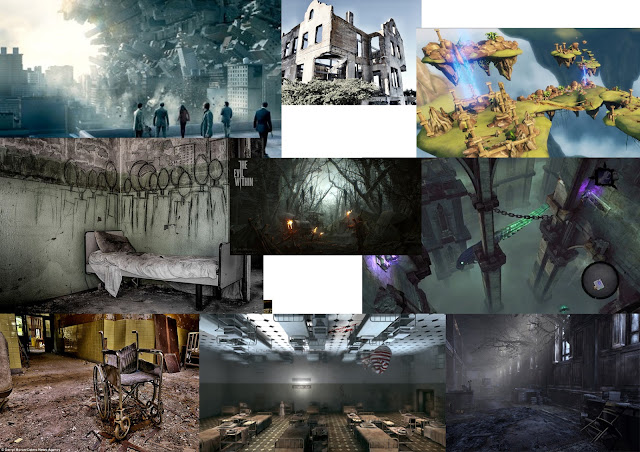
eventually after creating a mood board for the overall set design I had the
main premise for my game; where you play as a man stuck in an asylum, where
each of the patient's unique disorders have become creatures with their own
personalities and mechanics within the game. By using a Mood board i was able to better visualise the prototype i was planning to create, helping me think of mechanics, visuals and the overall mood of the game
 |
| Moodboard |
With the main theme of the game being inference, I figured
that as the player wasn’t being told what each creature represented, as well as
the other twists in the game, the player would be able to play the game and
figure out what was going on.
Week 2:
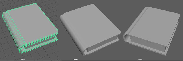
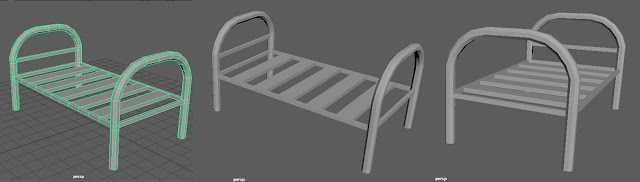
By this point I had my overall story done and was able to start creating concepts and assets I wanted to put into the prototype. As I had assets left over from the original idea I had, I was able to use one of them that was a book as an interactive item within the game to give the player information. I also created a bed modelled from a few real world ones and found these to be able to build up the prototype to give a little more life into the setting.
 |
| Book Asset |
 |
| Bed Asset |
As I was still finalising certain parts of the initial concepts for the game I decided to make the main character a therapist rather then an actual patient within the game, taking away some of the cliché of the horror genre and giving a different outlook on the creatures in the game rather then them just being monsters. I liked the idea of it being almost a third party kind of outlook on the situation of mental illness, as rather then alienating real world people suffering from these disorders, I feel the player would be seeing it through the eyes of the therapist (a twist within the game that would be shown much later on) and how he sees his patients. (http://www.nhs.uk/conditions/Schizophrenia/Pages/Introduction.aspx, http://www.rcpsych.ac.uk/healthadvice/problemsdisorders/schizophrenia.aspx, https://psychcentral.com/disorders/paranoid-personality-disorder-symptoms/, http://www.webmd.com/mental-health/dissociative-identity-disorder-multiple-personality-disorder#1,) Each of the creatures I made concepts for i wanted to have an overall theme as well as some symbolic elements of what they represented. For Multiple Personality Disorder, I liked the concept of Asura from Buddhism, in which it has multiple faces. I also included masks to represent each personality from seeing the Comedy/Tragedy masks.
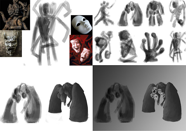 |
| Multiple Personality Personification Development |
By the end of the week I had finished the concept art of the first creature and was starting the second. As I knew I would not have the time to model the creatures themselves, I thought it would be easier to show the player what they would look like on the Sell Sheet instead.
Sell Sheet - First draft:
As I had never made a Sell sheet before I was felt very restricted in how I was going to portray my game. My very first draft was a simple grey gradient with the images and information about the game simply sitting on top. After looking at previous Sell sheets however I knew this wouldn’t be enough and looked almost lazy. I wanted to be able to keep some of the themes from main game present and decided to start working on it again.
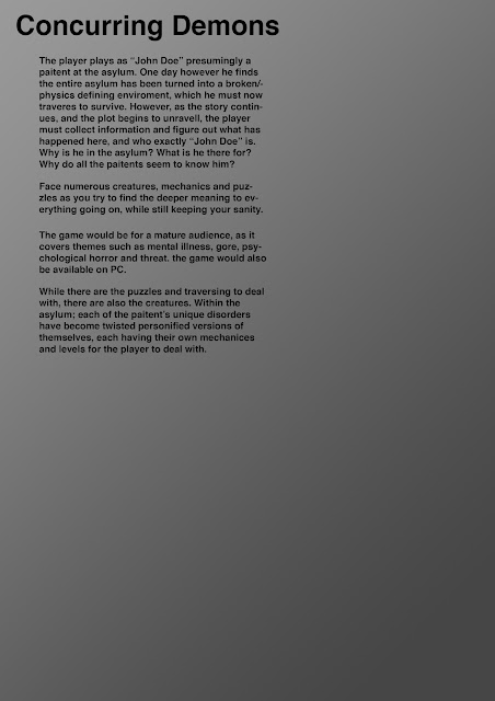 |
| First Attempt at Sell Sheet |
Week 3:
At the beginning of this week we began by setting up own controller. To do this we opened UE4 and set up actions and axis controls such as “W, A, S, D” to control movement and the mouse’s “X, Y” to control the camera. We set up camera (on our characters we also added a spring arm to be able to control the camera) and then moved on to setting up the blueprints so UE4 would be able to process the commands we were inputting. Once we were able to control the character and move the camera we moved onto level design.
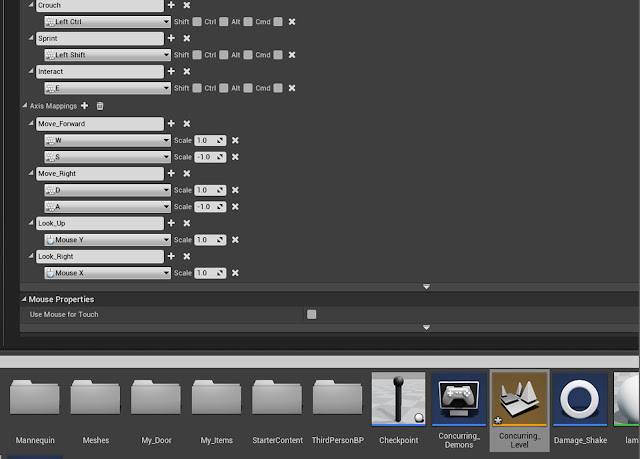 |
| Action and Axis Inputs |
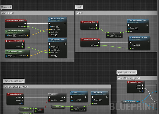 |
| Movement and Looking Blueprints |
This is particularly difficult for me as I had no prior experience with UE4 and had to learn through workshops, YouTube tutorials or from my fellow peers. I began by making the starting room for the player and building out from there, laying the floor plan of where the player’s path would be taking them. Taking inspiration from the idea of Unicursal and Multicursal mazes in games (games that have a singular path the player can follow or multiple paths/dead ends the player can follow) I decided to mainly stick to Unicursal, as I wanted the prototype in particular to be able to tell more of a narrative rather then having the player not be able to infer anything about the game or its story.
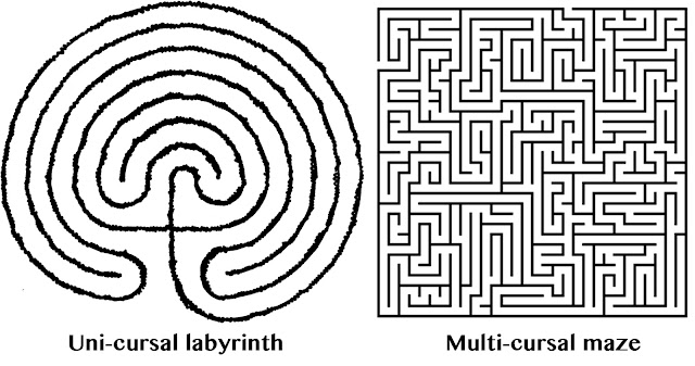 |
| Different Kinds of Mazes |
Since I was still new to UE4 and Blueprinting within the system, I found it difficult creating mechanics that would fit my game easily. I knew I wanted the game to have elements of platforming, puzzle solving and to incorporate at least a little of one of the creatures mechanics in the prototype.
I started out by drawing a crude rough birds eye plan of the game, as the game is set in an asylum, using simple corridors with arrows and colours to represent parts of the corridors worked best to create a basic idea of what the player would be walking through.
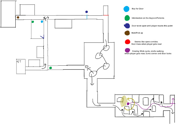 |
| Basic Birds Eye View of Game |
Once I had a rough idea of where the player would be going, I began by making the starting room and built out from there. This made it easier for me to start creating a game especially being main Unicursal, as I simply had to make a straight path, but as I was the setting was inside of an asylum I was able to add corners and different corridors, which made the game a lot more engaging then a simply straight path.
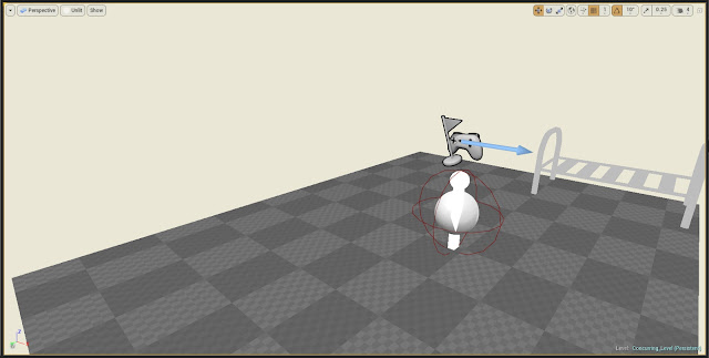 |
| First Room |
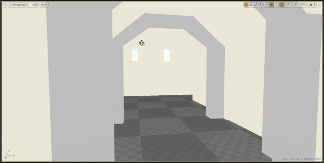 |
| Corridor |
I decided to go with creating Paranoia’s level as I found this would be the easiest to demonstrate within the prototype without giving too much away to the player. I began building the basic level design before trying to work on the mechanics.
Since i knew the basics of Paranoia's level I also wanted to create the option for the player to be able to sprint and crouch within the game, to do this I experimented with different sprint speeds as well as the overall walk speed for the character.
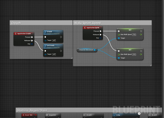 |
| Crouch and Sprint Blueprints |
By the end of this week I was also able to create health and stamina for my character. To do this i needed to learn how these work within UE4 (which essentially is all to do with numbers working in the background and the health bar decreasing or increasing these numbers in a progress bar fashion).
Before doing anything however I needed to make something called a variable; these are unique nodes within UE4 that are made to do certain functions, for example a Float (Light Green) node represent any number with a decimal point, anything like -223.4567, 19042.483 etc or a Boolean (Red) node can be used for true or false data, such as Events within the Blueprint. These can be really useful as in this instance when creating a health bar, a Float node with a set amount of health has much more flexibility then an Integer (Teal) node with fixed numbers (no decimal places). Integer nodes would be used for something like ammunition within a game, as a player can't have half a bullet.
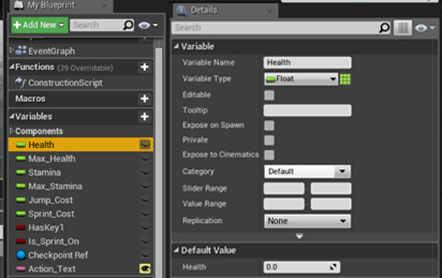 |
| Examples of Variables |
Once I had created all the variables I would need I now needed to create the bars representing both health and stamina in UE4, then make a HUD for the the bars to sit in for the player to be able to see.
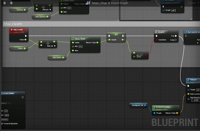 |
| Max Health Blueprint (Pt1) |
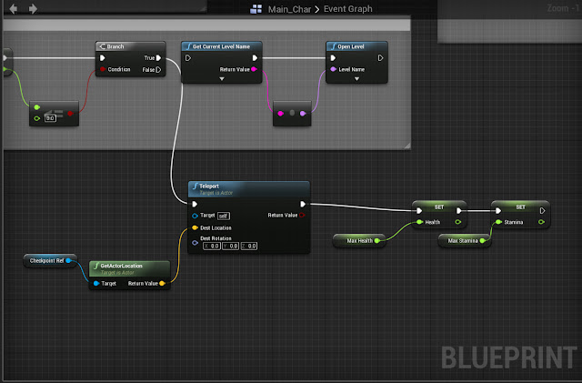 |
| Max Health Blueprint (Pt2 with level reset) |
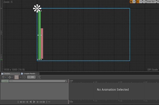 |
| Main HUD Screen |
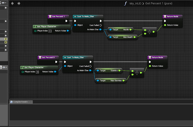 |
| Health and Stamina Blueprints |
Once these were created they could be iterated into different ways, such as jumping costing certain amounts of stamina, being able to regenerate Stamina over time, being able to take damage and many other ways.
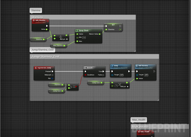 |
| Stamina and Jump costing Stamia |
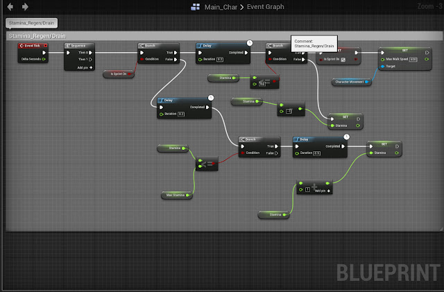 |
Stamina Regen
|
Week 4:
The original design of the level was to have the player follow the create where its search light would circle the room (which would be a fully model Paranoia if the game was to be fully finished), and the player would have to keep behind the creature while ducking behind obstacles to avoid being seen. To start I simply made the area that the mechanic would take place in; this was fairly simple to create as it was a box room with different kind of obstacles within the room for the player to be able to hide behind.
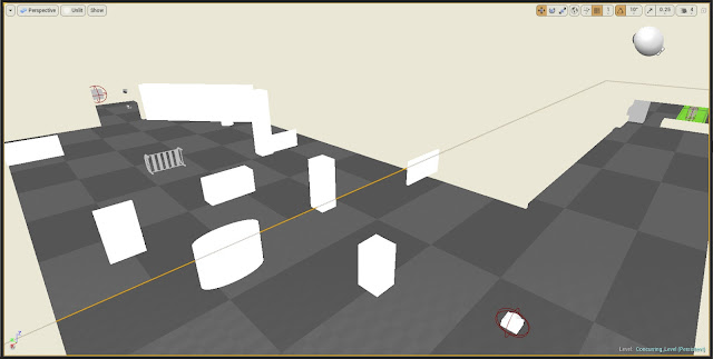 |
| Paranoia's Level |
I really liked this idea, as it would be hinting at the creature’s representation without giving too much away. However I found that creating the Blueprints for the AI was extremely difficult and I didn’t know how to combine the Blueprints to make it work.
However I still wanted to use this mechanic within the game, so with some help and tutorials I was able to create a light within UE4 that if it saw the player it would cause damage, which would turn on and off slowly. The way this works is having a light on top of an invisible 'pawn-sensing' within the Blueprint; the pawn sensing is always on, but only caused damage to the player if the player is within the light as well, setting up a condition so the player doesn't die immediately when stepping into the light. Once this Blueprint was created I was able to plan to iterate it to create different situations for the player at different difficulty, (including Paranoia's room).
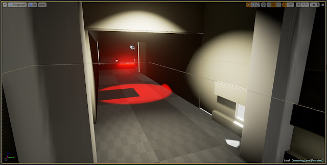 |
| First example of Damaging Light |
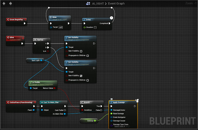 |
| Damaging Light Blueprint |
To create a harder version of this now i had all the obstacles in place, i duplicated the original light, and moved it to the other side of the room. I removed the flicker function on the light so it would stay on continuously, and used a 'Matinee' (which lets your animate within UE4) to make the light move back and forth, which made the search light that would represent Paranoia.
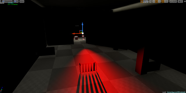 |
| Finished version of Paranoia's Level |
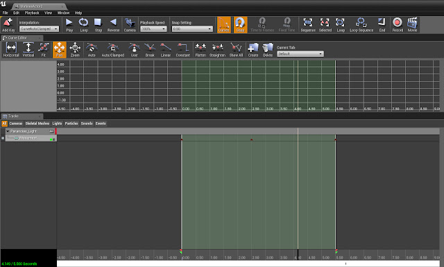 |
| Matinee to allow Light to move |
After a lecture with the project leader over types of pacing in games, I was greatly inspired by the Japanese structural narrative design of Kishotenketsu, where (in a games sense such a Super Mario) a mechanic is introduced, developed, twisted and then concluded. Although I wasn’t able to conclude mechanics, as I wanted to use as much variety as possible, I was able to see mechanics that I could combine them with others, making them increasingly difficult while still making the game engaging.
While this was going on I had researched and finished the concept for the second creature as well, as although I knew I wouldn’t be able to model this one or create the mechanics for its as well, I wanted to show the player what would later be in the game if it would be fully finalised and released. I took a lot of inspiration for this creature from existing artwork, as well as my own ideas. I liked the idea of the holes in its mask letting the light through looking for the player.
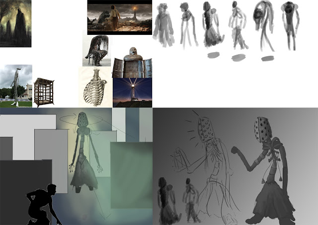 |
| Paranoia Concept and Development |
Week 5:
By now I had create basic moving platforms by using the Matinee tool (which is used by setting up key frames and dragging what needs to be moved and turning it into an animation) as well as the light for Paranoia’s level. I realised the player was walking on a set path so I decided to involved a locked door and putting the key at the end of Paranoia's room, which the player would find a book referencing the door as well as the light, without telling the player what the light specifically does. This was the player would be introduced the mechanic of the light in a simple mechanic, where the player would also be able to regain health afterwards if they were to greatly injured.
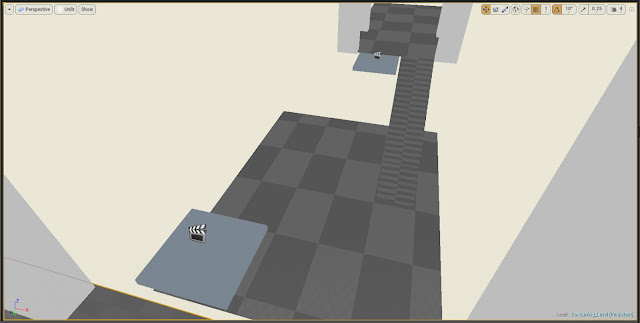 |
| Platforms added to first area |
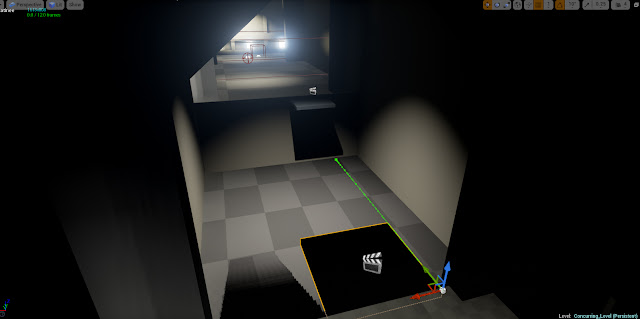 |
| Example of Matinee |
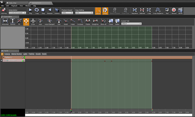 |
| Matinee for Platforms |
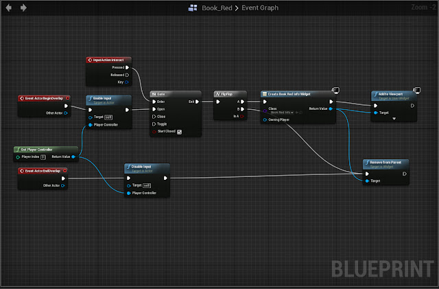 |
| Book Blueprint (for interaction) |
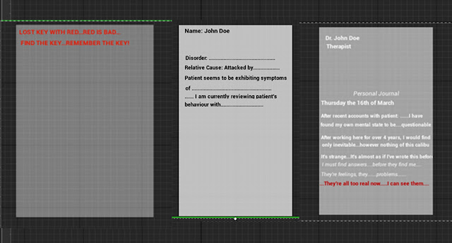 |
| Individual Book Widgits |
To begin this i designed the level which would branch off into two paths. First i had to make the game fair and give the player a way to regain health (keeping to the theme of Kishoketsuken in games were a mechanic is introduced fairly so the player can understand it.) To make the health pick up i made a cube with a box trigger, with a Blueprint inside essentially saying if the players health is below max, the item can be picked up and the player will receive health. To make the box float in a non-threatening manner i used the vector function within the event graph and added that to the Blueprint as well to make the box float.
"I enjoy the whole idea of it, but kind of feel like its not very easy to get through, considering once you die you have to start all over again...Also the book is a little difficult to see, i turned left without even thinking, so maybe put it before the light" (Curtis Mason- 4:18:30 to complete the game).
After hearing this and replaying the level myself, i moved the book into more of the middle of the room, as i didn't want to put the book referencing the door to far away, as well as not wanting it seem like some form of tutorial (breaking the immersion). I also added a second health pickup at the end of the room to make it more fair for the player; as well as taking into consideration that there was no checkpoints yet, so i made a plan to add those into the prototype at a later date.
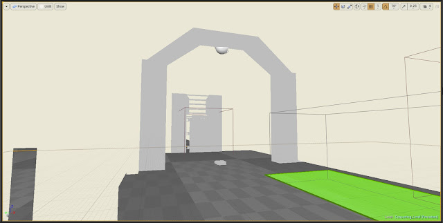
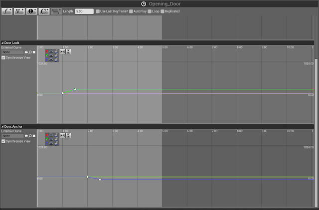
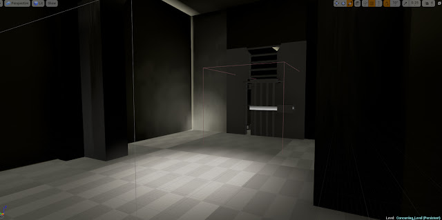
Animating the door was fairly difficult to grasp as it was another skill (Vectors) I had to learn an put into practice within UE4, however as one of my other projects was focusing on making a high poly model of a door within Maya, I was able to export a low poly version of it and use it within my game.
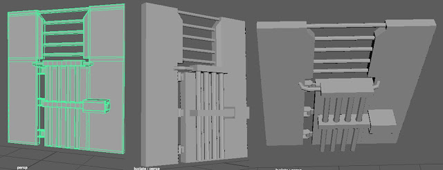 |
| Asylum Door Asset |
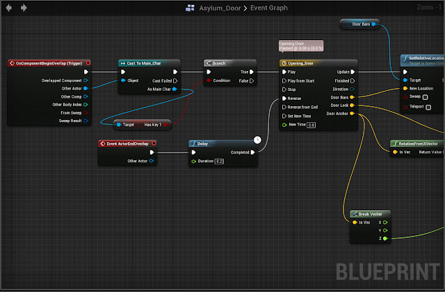
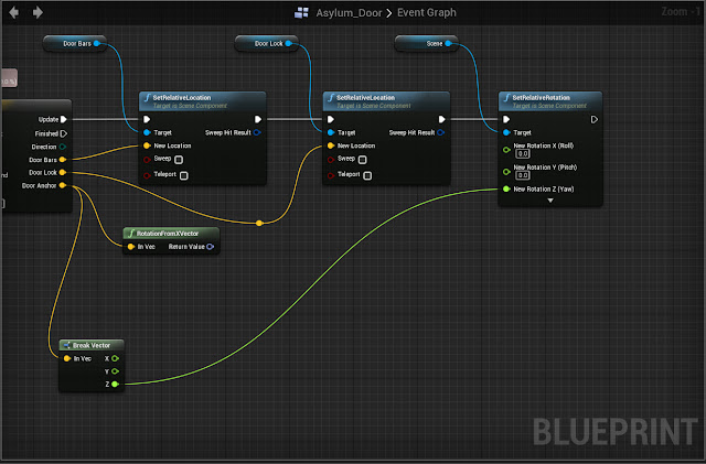
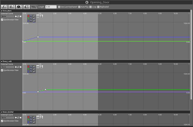
Once i had exported the door as an entire mesh as well as its individual parts (Frame, Bars, Lock and Door) with a little help i was able to set up Vectors to move each part alone certain axis' once the character enters the box trigger. For example the bars which move first move alone the Z axis first moving upwards, then the lock, and finally the door, each moving along their respective axis', creating the animation of the door opening.
 |
| Asylum Door in Game |
 |
| Blueprint Sheet for Door (Pt1) |
 |
| Blueprint for Door (Pt2) |
 |
| Vector Sheet for Door (Pt1) |
 |
| Vector Sheet for Door (Pt2) |
 |
| Door with Lighting |
As the project mainly focused on Indie Development, with essentially making a game (or at least a prototype) I was able to use existing assets, ideas and other things from other projects, and recycle them for this project, which I found worked really well for creating the prototype as well as saving time.
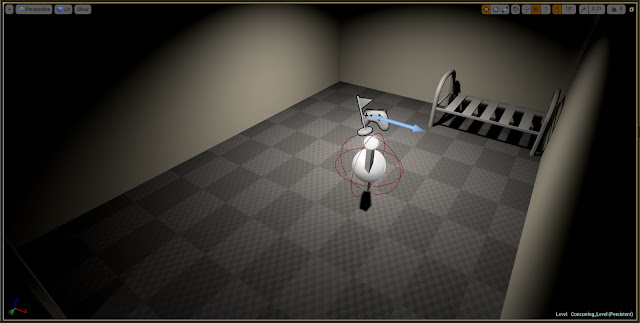
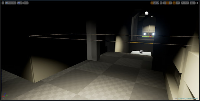
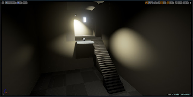
By watching more tutorials as well as testing other blueprints, I was also able to make different kinds of lighting such as flickering lights and even lights that turn off once the player enters them. As lighting is essential to a horror games atmosphere (if that’s the type of game a person wants to create) once I was able to add some different kinds of lighting within the game I found the prototype was starting to come together.
 |
| Lighting in Game |
 |
| Finished Lighting |
 |
| Finished Lighting |
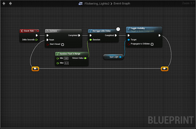 |
Flickering Light Blueprint
|
As the main theme for the game was psychological horror I wanted to add in more mechanics or sequences that play off this theme. After a workshop with project leader I wanted to add in some form of mechanic. I decided I wanted to almost like a ghost that would run across the opening in the hallway and would disappear before the player could get round the corner.
To do this I first made an actor blueprint and imported a third person skeletal mesh as well as a pre-made third person animation to make what was running across the screen seem more human looking rather then a cube and sphere. Once the aesthetic of the mesh was made I needed to create the Blueprint telling the Actor what to do. I also needed to create a Nav Mesh for the Actor (which tells the AI where it is allowed to move to). Once all this was created along with using a print string node that allows text to appear on screen once the animation starts. Finally I need to set a trigger box around the corridor so the player would see the Actor running across the screen without getting to close.
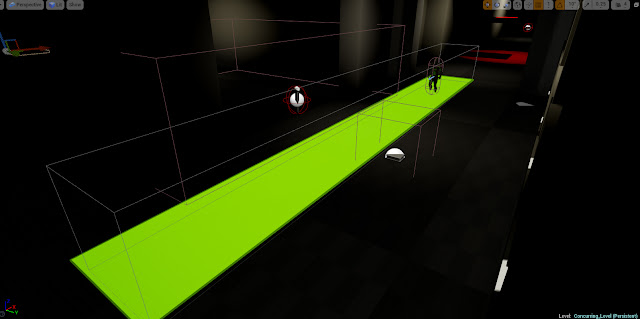 |
| Navigation Mesh for AI |
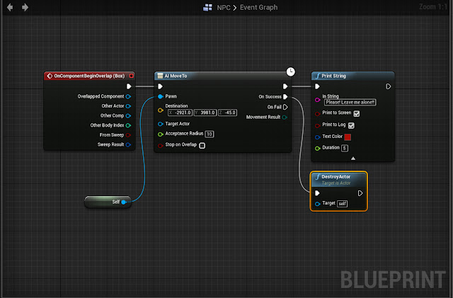 |
| AI's Blueprint |
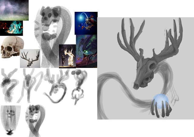
I was also able to finish the third and final concept for another creature within the game. Although I knew I wouldn't be having it's mechanics within the game, I thought i would be nice for reader of the Sell-Sheet to be able to see what another of the creatures might look like within the game. This creature is supposed to represent Schizophrenia, having the peaceful deer skull on top, with a light similar to an Anglerfish with the light to lure in its prey. I liked the symbolism behind this piece with the creature having a ghost like appearance, as it would trick the player with it's peaceful demeanour before revealing its true self.
 |
| Schizophrenia Concept and Development |
Sell Sheet - Second Draft
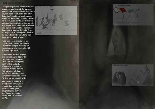
For my next draft of my Sell sheet I wasn’t too sure what to do. Only having two pages to work with didn’t give a lot of space to show the best features of what the game really could be. As I had already drawn up two out of three creatures within the game I decided to draw more concepts to present them on the Sell sheet.
As with examples and thoughts from my project leader, I planned to incorporate some form of element from within the game to be the background of my Sell sheet. As the game was set in an abandoned asylum I thought I could user a concept image as the background as I believed this would be a good way to show off the theming of the game without taking up to much room.
The image I used was a hallway concept from the game, having the first hallway dark and seemingly unending, where as the second page of the Sell sheet would have a light appear at end, revealing a monster coming into view. Although I thought this was originally a good idea, once I started adding text and images to the sheet I realised all the focus was being drawn to the background and none of the information would be given attention. The overall image was too dark, and most of the text was being lost within the background, making the Sell sheet useless. I scrapped this idea and tried starting brainstorming again for another background.
 |
| Second Attempt at Sell Sheet |
Week 6:
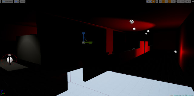
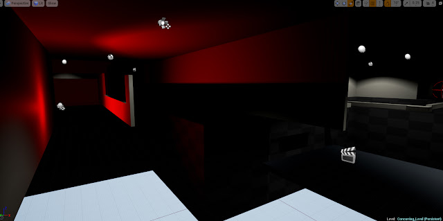
By this week I have been able to finish areas one and two for my game (that being the opening area and Paranoia’s level) and it was time to move onto the next stage. As the prototype needed to have five minutes worth of gameplay, I decided to use the process of Kishotenketsu and combine the elements of the damaging light and the moving platforms for the end sequence of the game.
For the platforms I used the Matinee function within UE4, and for the light I was able to recycle from Paranoia’s level. A lot of the prototype I found myself to be recycling already existing mechanics within, however as I was taking inspiration from the structure of Kishotenketsu, I found this to work well to increase the difficulty for the player without having to break the immersion of the experience with multiple tutorials information pages.
 |
| Combined Mechanics (Light + Platforms) |
 |
| Combined Mechanics (Light + Platforms) |
This way the player could experience each mechanic, understand it, and then once the difficulty increased the player wouldn’t feel like it was unfair or confusing, as they have had all the time they need to get used to the mechanics.
I combined the moving platforms with the damaging light to create a more difficult obstacle course, having the player needing to jump between platforms as well as using the crouch function to hide from the light. In hindsight I feel i could have put a more complex twist on the mechanics, however as I was still struggling to fully understand Blueprinting with UE4.
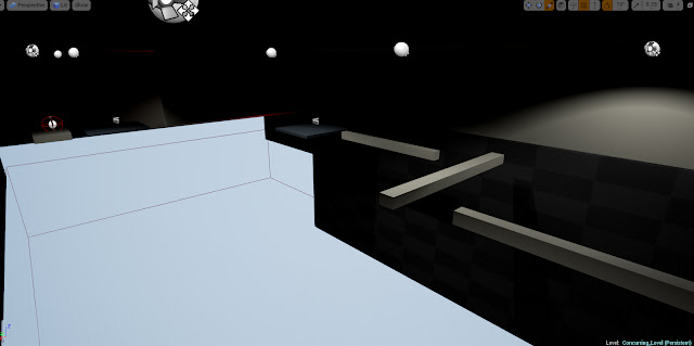
Once the overall stage was created I had someone play test it a few times to see what they thought of the overall design. At first they found it difficult to jump to each platform as well as the floating blocks. They also felt they didn't have much time to take everything in and kept dying on the second stage.
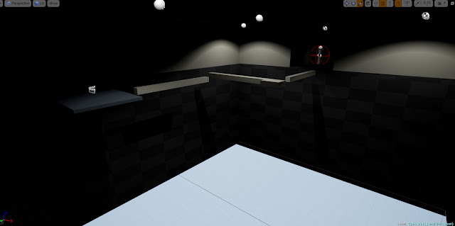
"It's pretty difficult to navigate the platforms. I get it's a horror game but with the lighting so low I honestly can't see the platforms. I think you should put a checkpoint halfway through, otherwise people will get annoyed at dying over and over again." (Ben Lilly - 10:11.53 to complete the game)
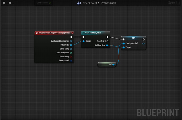
Once I had reviewed what my play testers had to say I went back and decided Checkpoints where the first thing I'd need. To do this i watched a few tutorials online and tested different kinds out to see what worked best, and eventually found what i needed
 |
| Checkpoint Blueprint |
I also added more health packs as well as making the floating platforms slightly easier to jump onto, as i didn't want to make it too easy for the player.
 |
| Platform Area |
 |
| Re-vamped Platform Area |
Sell Sheet - Third Draft
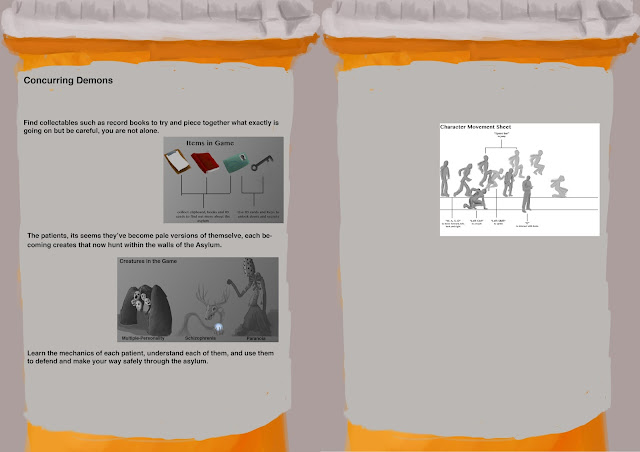
My third idea after discussing it with project leader was to have all the information about the game being on the label of a medicine bottle. I thought this too would also work really well as it would portray the main point of the game about mental illness while at the same time being a different way to market the game, rather then a 2D sheet.
Once I had drawn out and coloured the bottle, I began adding text and imaged to the sheet. However while adding images to the sheet I realised I was running out of space really quickly, as was wasting a lot of space with the background. Although I could have possibly made the images or text smaller, I felt this was too much of a gimmick and scrapped the idea again. Even though I thought it would have been a clever idea, I eventually felt that I was wasting an incredible amount of space I could use instead to show my game.
 |
| Third Attempt at Sell Sheet |
Week 7
By this point I had finished most of the game and was now applying final touches. I had put the final parts of the level in after the last platforming area including a room identical to the starting room however this time with a door and a book giving the player some form of explanation and exposition. I did this as i found this fitted the idea of the prototype or hallucination, however it could still be open ended and alluding to a much bigger and more complex game.
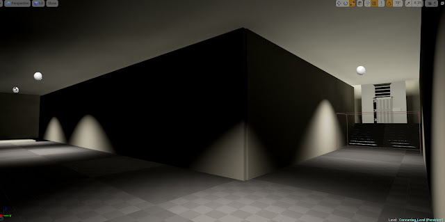 |
| End Corridor |
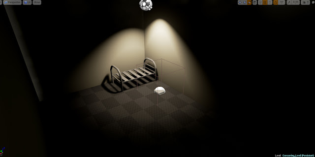 |
| Final Room |
Once the entire prototype was finished I once again asked someone to play test it. After they had played it I once again took their input into account and tired to see what i could change. The people who had already played the prototype before where happy with changes I had made, saying it felt "a lot more fair to play". I asked a new person to play the game to get their point of view as well.
"I really like the concept and lighting you've put in. The only problem I'm having is knowing when I'm taking damage. It's all well and good to have the health bar there but It happens so quickly its kind of hard to know why you've died and have to try again. Maybe try putting in a camera shake function to when you take damage..." (Greg Morely - 8:32.16 to complete the game)
After hearing this I thought it was definitely something to look into, as if i lowered the damage I felt the health pick ups would seem a bit meaningless. I watched a few tutorials online and once I knew what to do it was mainly adding Blueprint nodes inside the character blueprint.
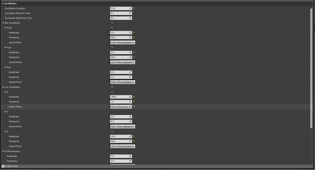 |
| Camera Shake Details |
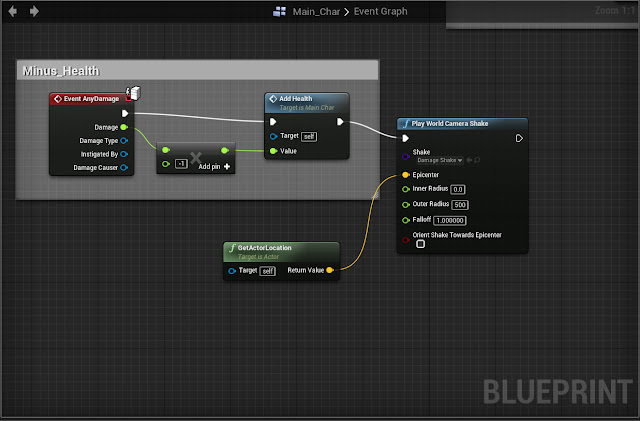 |
Minus Health Blueprint + Camera Shake
|
By this point I was happy with the game; I had added all the mechanics I wanted as well as iterating them and applying them to different parts of the game. I was particularly happy with the overall level design, by using the lighting and overall atmosphere in the game to create what I was hoping for, which was the overall aesthetic of an asylum. Although I feel that I could of added much more mechanics to the game, possible incorporating one of the others creatures mechanics within the prototype, with my current level of knowledge of Blueprinting and UE4 as a whole, I knew that with I wouldn't have the time to add another complex mechanic within the prototype.
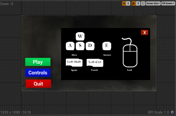
The last thing I added this week was a start screen as well as music to set the mood for the game. To do this I used an existing concept art image I had made to go on my Sell Sheet as the background of the start screen. To begin I made a new HUD widget which would appear on the screen first before the game; this HUD would have the background and three buttons, each saying "Start, Controls and Quit" respectively. Once the overall HUD was mad i went into its event graph to start setting up the Blueprint.
 |
| Start screen HUD |
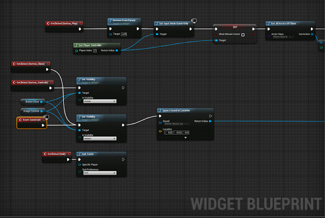
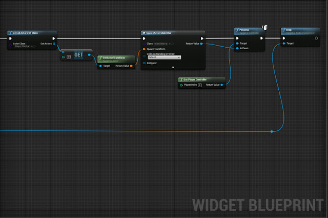
To do this I set up the blueprint making it the first thing the player would see and assigned the buttons to different functions. The start button would begin the game, spawning the player at the player start feature in UE4. The controls button would make another widget appear on screen displaying the controls (which i also had to make myself within Photoshop). This widget also has a button that would appear allowing the player to press it to come out of the controls menu. Although there is a way to set it up for the player can simply press the controls button again, I felt this simply added a little detail to the start screen. Finally the quit button simply quitted the game.
 |
| Blueprints for Start Screen (Pt1) |
 |
| Blueprint for Start screen (Pt2) |
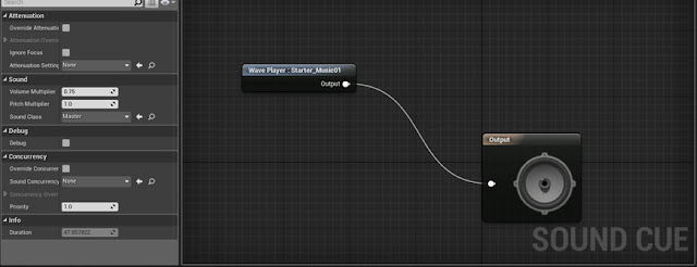
Once all this was created I tested it to see if it worked and moved onto adding audio into the start screen. Since i didn't know much about importing audio into UE4 I decided to use the default audio that came with the UE4 starter content. To do this I needed to made a music cue, and then hooked up the nodes within the Start screen HUD to play once the game starts and ends once the play button was pressed.
 |
| Audio for Start Screen |
Sell Sheet - Final Draft
is finding journals to give the player exposition and information. I decided to make the background of the Sell sheet look like ripped out pages from one of the journals using effects within Photoshop.
Originally, this idea stemmed behind all the information about the game being left to the player, which in turn could be presented as a Sell sheet. The problem with this was depending on would be reading the Sell sheet, different types of language and formality would needed to be used (like comparing the Sell sheet of a Kick-starter game to a AAA game).
In the beginning the Sell sheet was rather plain, only having a light grey background and the images seemingly placed randomly onto the page. As I was told we weren’t allowed to use pre-existing images (such as for mood boards) I needed to get rid of some images.
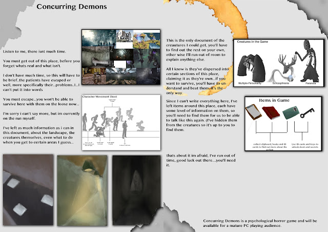 |
| Fourth Attempt at Sell Sheet (Background Theme Chosen) |
Because of this I created some new images to fill the spaces. To do this I took screenshots within UE4 and then coloured over them, showing what the finished game may look like. I wanted to take more pride in my work so I looked at colour schemes and organisation on a page, and began to iterate my work.
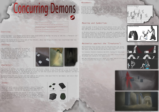 |
| Final Sheet |
I decided to use both kinds of language, as the top of the Sell sheet would have an extract written seemingly in handwriting addressing the reader directly. With this being the main thing that draws the reader in without giving to much away, I could then move onto talking about the game itself.
Eventually I found a type of font that worked and was able to make the Sell sheet look like some form of CIA looking document, having the images look like they are 3-dimensionally placed on the sheet and the text looking for formal. I also looked into Iconography and used it to give details about my game in a way people would remember, such as having an icon of a brain telling the reader it was is a psychological game.
Overall I am much prouder of this Sell sheet, as it shows a lot more detail and time being put into it compared to my very first one. Each conceptual image can be seen clearly and nothing seems to overtake anything else. I’m glad I was able to implement the creature’s concepts images I worked so hard on as well as showing their mechanics in a very simple but aesthetically pleasing way.



