Friday 13 November 2015

Research on Light, Colour and Composition


Composition.

Although there are many comic books covers I found that use placement and such to create a appealing cover to interest the reader, when looking at “DareDevil issue 97” with art created by Marko Djurdjevic, what Djurdjevic used was the “L” layout to create a frame within a frame. What the artist has done is used the bodies and floors of the 2 on the cover to create the frame, with both their faces being within the second frame. DJurdjevic also used lines to follow the line of sight and also going from mouth to mouth giving a sense of danger and threat towards the main character.


The ‘Kingdom Hearts’ franchise has become an extremely well know series, with only having 2 games on major platforms. Saying this when ‘Kingdom Hearts 2’ was realised the games cover art was very similar to the first game; having the main cast on the front cover, which included 5 characters for the first game. The second games cover art was also similar by the usage of placing the all the main cast on the front, including 2 new characters. What the artists of ‘Square Enix’ cleverly done was by using the Rule of Thirds to place every character either on a focal point or alone the lines, creating a very balanced and somewhat symmetrical image even though every character looks different.


Lighting and Colour.

“Darksiders 2” is somewhat different to its predecessor game; this cover art being much more detailed and defined. The cover art in my eyes uses the ‘Cross’ and also ‘Iconic’ placement of the main character. I believe this because the used of having darks on light on the top half of the image and the reverse on the bottom half. This is seen such as the shadow that mainly cover the “Death’s” (the main character) body and face, where as the horse underneath has light patches all over, considering the light source is behind the figures and should be a complete silhouette. I also believe this cover art to be iconic as the head, angle of the arms, hands, and over all look of the image follow the lines of an iconic layout.


The ‘Uncharted’ series is a very popular gaming franchise so having an eye catching and interesting cover to attract players familiar with the series is a must. When looking at the cover art for “Uncharted 4” the main character stands in the foreground with a forest and foliage almost creeping in around the sides. I find this piece uses the cross, as the top half is dark on lights as with the characters shadowed face and clothing and vice versa for his hands, gun and trousers. I also think this is great use of colour as the background uses blues of a different range to create almost a moonlight look, which would look tranquil, however with the use of shadows it now looks like the area around the main character is creeping around him. 


Bibliography:


BA1a Task 3 - Character


 When I first read the Tinder Box there were many characters to choose from. Although many seemed interesting I decided to go with the soldier as he had the most description I felt I could work with at the time, as well as certain personality characteristics I felt I would be able to translate into his overall appearance; such as his greed towards money, his heartlessness when killing the witch or his lack of knowledge of people using him for his money. In my first rough silhouettes I tried to stick as closely to his description as possible, such as the knapsack on his back, his boots and his sword being the things he carried. It was only after talking to my lecturer that I was told I was able to be a lot border with my ideas. 


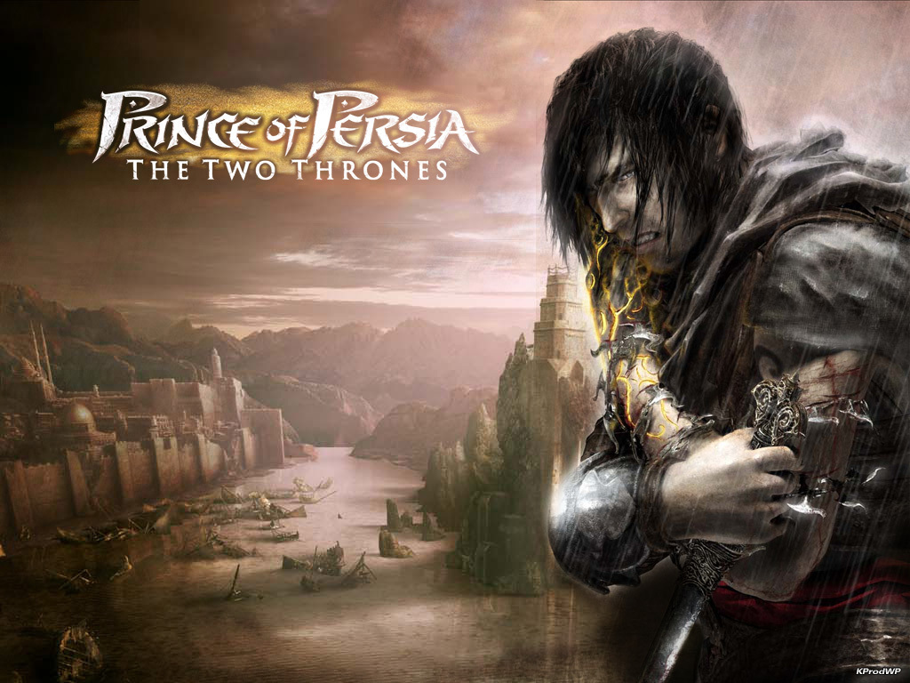
Most of my silhouettes have a large amount of inspiration from the game ‘Prince of Persia’ as it matched my theme and had a fair amount of ideas to work from. However I found that the images I used seemed to stem too much from this so I had to reel it in so I didn’t cross the line of plagiarism. I used the same method I always used of having a basic human shape drawn out and adding detail over the top which is much more effective time wise as well as quickly getting ideas down. By about the fourth page of silhouettes I had fleshed out the figure more and started using more detail to show such things as clothing, facial hair and other things just to show a difference in design.


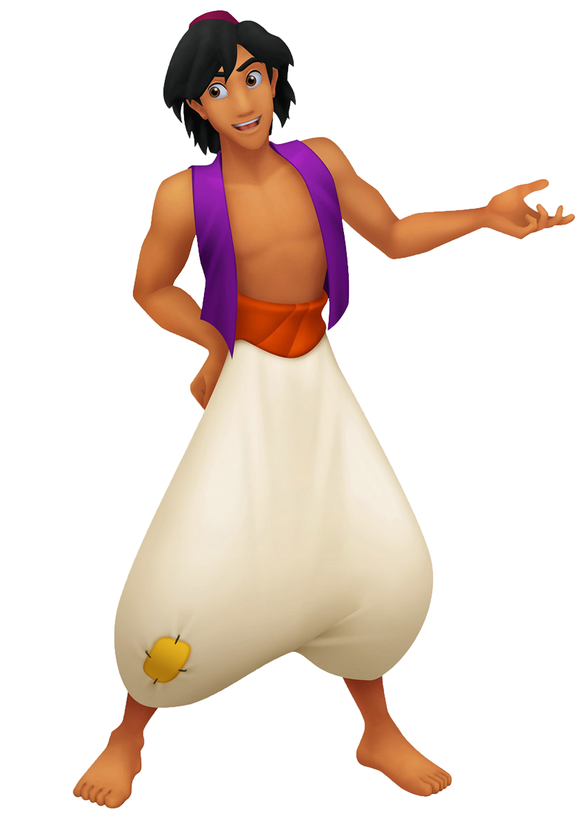
Before I continued with my character I went and create a mood board based on how I wanted my character to look. I looked at a few articles of clothing from Persian paintings and historical work, as well as from other people’s views. As before I also took inspiration from ‘Prince of Persia’ the game as well as the film ‘Aladdin’ as it is believed they are heavily linked from the solider, witch, princess and dogs linking to the films characters. Although I didn’t want to take to much from the media sources they helped a lot in looking at culture and basic clothing.


After I had a rough idea of what I wanted I started designing hair designs. These were very rough and some not being very practical; however I wanted to get as many preconceived ideas out of my head just as a reference for later on. The designs stemmed from having hair tied back to a completely shaven more masculine tone to them as I still hadn’t designed much about the character’s overall backstory or goals, other then what was already told to us in the story. 


 Although I started and ended with the solider I also did some design into a male version of the witch. I liked the idea of this wandering nomad warlock with some sort of mask or mystery behind him. Although none of these clothing designs were used it was interesting to see how much of a character I could change while at the same time keeping them in the stories setting.


It then came to further designing clothes and other garments for the soldier to wear. At this point I had talked with my lecturer and made my own backstory for the solider; being that during the time period the Persians used slaves for manual labour when a great war came, rather then sending troops out to die the Persians sent out slightly armoured slaves to try and take out some of the other troops, the main character (the solider) ran from the battlefield, and ran away, hence leading up to the events of the Tinderbox. Since I made this backstory as I wanted the character to be in less armour then a conventional solider, with rags or bandages covering his body from the wounds he received. I also decided to keep the shackles of chains around his ankles to further signify he was once a slave. Once I had this backstory set designing his clothing was much easier, giving him ripped clothing or bandaged arms and legs to show he was wounded during the war.


Once I had chosen the basic design I wanted I started to iterate what the overall appearance would look like. At first I found it difficult drawing fabric and using colour in this way however after asking for advice from my lecturer who also drew up a design idea for me to gain some inspiration from I found it much easier. We both had the same idea that after the solider fled the battlefield and he wandered the desert for some time, which was why his clothes were so ripped and torn.  We also discussed about why he wore the hooded garment, which at first I simply liked the design, but then made it also he wore the coat as a way to hide his appearance as he was technically on the run from the Persian Empire for desertion. He used the coat to cover the little armour he wore and also that he was a slave. I also wanted to create a reason why he was so greedy in the Tinderbox and decided to link his heartless killing of the witch to him seeing this as a way out of returning as a slave.


The colours I initially went with were desert like colours like sand or gravel, as well as browns from dirt. However what I found was some of the brighter colours worked just as well. For example one of my favourite iterations was on the second page, which used a lime colour. I really liked the way the colours worked on the fabric he was wearing. This may also have been to do with the way I drew his coat, as after my first few designs I kept the long ragged look but also changed how the coat sat on his figure, whether it was a more poncho bases coat or whether it swirled round this body in a somewhat fashionable/appealing sense. When designing my character I wanted to dive into more then just his outward appeal, as that I wanted to also look at the personality of the solider and what made him into the character we meet in the Tinderbox. I found after making his backstory his outward look was more tired then anything else, of course I wanted him to be strong and war-torn but in addition I wanted him to seem tired and fed up of all the things he had been through prior, hence making him act the way he does in the existing story as well as his attitude portrayed by his appearance. Because of this I kept arrows in his back as although of course these would cause pain, his attitude would be more uncaring and he would eventually not care about it, and simply focusing on running away.


Once I had picked an overall design I liked, which was the dirt covered nomad look, I went and showed what would be under his coat. This was fairly simple as I had already pre-existing clothing designs from before. Most of these were created from scratch but I did use some inspiration from my silhouettes before such as the use of bandages. I kept the idea simple and easy as his coat would be the main piece. I didn’t want to give him heavy armour as I felt that he wouldn’t be wearing it at this point as well as it would be heavy to carry. I made his notable mark of fighting in the war as his arm bands, as I wanted these to have some sort of marking that said he was a solider or from battle, which I further developed later on. I kept the overall design pretty simple but had them either plated with metal or more complete straps rather then just some leather around his forearm. As for his clothes under the coat they were all ripped or dirty trousers and some form of bandaging for his wounds.


After talking to my lecturer about characteristics through facial expression. Like before he drew a rough version for me to use and I was able to create some facial expression from this. It was still very difficult to create faces that had life in them and the first few drafts looked either to small for the head they were on or just looked lifeless. However after Nigel’s (lecturer) draft I was able to slowly piece parts together and get used to how a face works. Because of the problems I was having I am planning to do some studies into how to draw faces better so this problems doesn’t arise again.


Once I finished with the overall look of the solider I moved to working on his character and model sheet. While working on the character sheet I found a useful trick to create movement and the way they do certain tasks. But drawing out a pose, then lowering the opacity of that frame and then drawing over it, it’s almost like a very rough stop motion piece, and by doing this I ended up with a collection of movement that looked more fluid then drawing them out individually. These made the movement such as using his sword or climbing a wall seem much more together then just a single frame of movement. I also choose to colour him in just a single colour rather then adding to much detail, as I wanted the focus to be on his characteristics. My favourite out of the sheet would have to be the use of the tinderbox, as I knew how I wanted him to use it but didn’t know what would happen next, making me have 2 designs I couldn’t choose from as I liked the idea of both.


The model sheet was slightly difficult as I have to design the flowing fabric would look like from multiple angles. I found this quite difficult to do but feel I made it work well. I also designed to add in what the character would look like with his coat open rather then shut by the wind, as I needed to see and show what all the clothing pieces coming together looked like. I also added in his sword, as before I was going to have the sheath on his back however the look wasn’t right so I redesigned it to be around this waist. I like this more as not only does it seem to fit the Persian theme more, it also means it can be another part of his past life he keeps hidden under his cloak.


For my final I began with drawing out my character in a pose, timing it just after he has stolen the tinderbox for himself. I wanted the final image to show not only his new attachment to the box but also some of the world he lived in. I choose to have him sitting looking like he was contemplating what to do next with the image of the tree behind him. However once finished the image didn’t look right with detail missing from both the solider and the are he was in. I tried changing a few things around but the image didn’t look quite right. I decided I should start again and focus more on detail and making the character look how I imagined them rather then trying to force them into a pose or scenario I couldn’t see them in.


For my actual final I choose to have in in a knelt position in the desert. I spent at lot longer on this image, using varying layers of brushwork to try and create the look I wanted. Although there are still things about this image id want to change, such as the detail in the background and the detail of his clothing, I find I like this this version much more. The desert looks like it has different levels to it and the solider seems much more human looking. I wish I had more time to work on the face and hair however I’m still glad with the overall outcome. Used the same colour of the sand to create marks on his clothes like they where dirty and also like the way the coat is blowing in the wind. In all I am very happy with how my work came out, although there are a few things I would have liked to work on, I’m glad my character fits the Persian setting and that I was able to but enough detail to have him look like a final concept.


Bibliography:

http://media-cache-ec0.pinimg.com/736x/1a/ca/a7/1acaa70ff4d19b0122b5c392e3e01311.jpg

http://world4.eu/wp-content/uploads/2013/04/ancient-medes-clothing166.jpg

http://41.media.tumblr.com/e15d31a65549c7296ff4c23d2b9db0ed/tumblr_ncqn86POuB1skaxu8o3_1280.jpg

http://aminus3.s3.amazonaws.com/image/g0008/u00007592/i00921147/6427482a39ca28051d72258a178c19f1_large.jpg

http://i0.wp.com/www.kavehfarrokh.com/wp-content/uploads/2013/08/achaemenid-Elite-Immortal-Guards.jpg

https://persianperspective.files.wordpress.com/2007/03/httpmedia.putfile.combayrouachaemenid-soldier1.gif?w=553&h=480

http://cf067b.medialib.glogster.com/media/bb/bb9eb5cd65efec44d1649bce450769687b36845b636d551e4716ec9f20c3ec49/slavery.jpg

https://ritabay.files.wordpress.com/2012/02/slave-market.jpg

http://www.justpushstart.com/wp-content/uploads/2010/12/popww5.jpg

http://assets2.ignimgs.com/2008/05/28/prince-of-persia-20080527114815313-2413264.jpg


BA1a Task 1 - Insect


For my silhouette concepts I used a standard brush with a medium opacity setting. I did this because I could use the first layer of paint to create the overall form of the insect and then use the darker greys from the brush to add a little detail. Doing this also helped me remember the basic forms and a very rough idea of the overall piece.


Once I had picked the design I wanted I took the basic layout of the insect and started to change aspects of it such a the shape of its legs, arms, head, eyes, and even the way it carries it satchel. The insect is supposed to be some form of fly catcher were it uses its one long arm to extend out and catch prey then putting it into the satchel it carries.


Before I started my final piece I drew a quick silhouette drawing of my insect and done a quick colour variation sheet. I did this as although I had a pretty clear idea of what my final would look like I wanted to show variation and possibly find a new different design that I liked. I would have liked to a few more variations but with time management that was not possible. I used basic colours as these could be expanded into a much broader range in tone and shading.


Once I had a better understanding of what my insect looked like, I took that design and used it to show its characteristics; such as how it walks, hunts, and opens and closes its jaw. I also realised I didn’t like my original idea of how to caught prey and changed it from instead of a simply long arm it was now had multiple sections which extended out. I found it interesting being able to start with just a silhouette and take it this far. The character sheet I feel shows all the things that is needed to know about my concept.


I found that drawing out my final illustration to be quite difficult; at first I hadn’t used Photoshop much before this course was set and because of that, my first attempt at drawing out my illustration was quite different to the way I imagined it. The body looked to metallic and just seemed rushed and hadn’t had much time put into it. The colours I had used didn’t seem to blend to well and as well as now looking like a metal outer shell rather then an exoskeleton.


 My second attempt came out much better, as I used a wider variety of brushes and colours. The body now looked how I imagined it to be having more of a green exoskeleton with the spine and bottom half of the legs being the only parts visible underneath. I also used reds and oranges for the eyes to contrast against the green armour. For this version I used a dark charcoal type brush to create a silhouette with a slight depth to it, and then used low opacity colours to slowly build up the colour giving me a lot more control then before.


I found the same problem when starting to create the background/environment in which my insect inhabits. After experimenting with a number of brushes however I was able to find what worked best and am now happy with how my concept came out. I used a series of brushes that looked like leaves to create the foliage and used rock like brushes to create the earth and found these brushes to work very well in creating depth. I would have liked to be able to learn more about making the foreground match to the background, although being a simplistic concept I found it very difficult to do so and would like to further look into how I would be able to achieve this; saying all this though I am happy with the end result I was able to create.


BA1a Task 2 - Timepiece


For my Timepiece at the beginning I didn’t have much of an idea of what I was going to create. I knew that the piece had to measure time but other then that the project was relatively open. I began by using a low opacity brush to draw out random shapes of the first thing that came to mind, usually some form of object with a clock on it.


. As I continued my silhouettes I began to utilise what my basic idea was; an object that didn’t just measure time on a basic scale; by this I wanted a Timepiece that either didn’t just measure minutes and hours but a much larger scale (such as days/years) or a Timepiece that actually used time rather then just measuring it alone.


Although I knew what I wanted the piece to do I still didn’t know what the overall form it would take, having most designs being simple objects with clocks or dials in them. By about the third page of work the silhouettes became slightly more detailed as I started to understand more of what I was doing, however my actual final design idea didn’t come till the final silhouette page.


Once I had reached a design of what the Timepiece basic look and functions would be I began looking for images for inspiration. I wanted my Timepiece to combine aspects from both Steampunk and a supernatural element; I liked this idea as it combines 2 opposites, science and magic. I went online and looked at different pocket watch frames and parts such as cogs, gears and even lighting for the Steampunk look. For the supernatural aspect I used elements from my favourite game series ‘Darksiders’ as it used magic, souls, runes and other parts of that particular genre. Once I had chosen what I thought would look best I picked out colour from the images and got to work on iterating my basic design.


When I began iterating my design I knew certain parts from the original image I wanted to be key factors in the final design; some of these being able to see the souls and the clockwork parts moving. My first page of work used the same process of drawing out each watch individually which, although gave each one a unique look, did cost time which I was able to correct in the second page of iteration, were I drew out the basic circular frame and copy and pasted the frame over and over and simply drew over the top, saving a lot of time. As with both pages I thought of a number of different designs, from having storage vials to a more satanic frame. Some of my designs I look back on and think that they didn’t have much thought put into them, such as a simple design of cogs in the main frame and the souls in the background or one where I basically copied one of the pocket watch frames from my research. However some that didn’t go into the final design I also really liked, such as the watch that looks like it was stitched together with skin or the one with the rotating soul containers.


As I couldn’t choose between one overall design, I took multiple designs to the next stage were I placed the first basic design and chose which parts of the iterations would go where. I chose which colours would look right in certain places and what key aspects of each design would work best in each part of the final. I used the original design as I was the first one and I liked the overall layout of were everything was, however some parts did need to be changed around. I also at this point realised that certain parts may not work, however I kept them on the page as I was still deciding at this point.


Once I had drawn out what the final design would look like I then drew out what the back, sides and a rough ¾ view would look like creating my model sheet. I then copied each viewpoint onto a new document, completely blacked out the shape and started adding colour to my designs. At this point time I hadn’t chosen what colour the souls that powered the watch would be so I coloured the front and back the exact same, leaving out the part where the souls would be and copied the design so I was able to just add the colour without having to re-colour the image again, saving a lot of time.


As I knew what the sides would look like colouring them was fairly easy. I chose to also leave the colour palettes of each image to show what colours I used. I found the heart the most fun part to do out of the images as I used a real image to create my colour palette, which made it much easier to make it look realistic. The other colours were from the ‘Darksiders’ images and the light for the light bulbs was from a real Steampunk bulb.


Once the colouration was roughly finished I drew up the functions of the pocket watch in rough showing how the watch worked. This ranged from how the cogs on the side would spin (being able to set the minute and hour hand), how the bulbs would light up when the watch was powered, the heart beating, which would spin the cogs that moved the hands on the clock, and opening the watches front to absorb souls that power the entire device. For my inspiration for the watch I also briefly looked into a few games that involve necromancy, as that is what the watch is loosely based on and found the ideas behind it very interesting, such as using and manipulating a living soul.


When it came to the final illustration I wanted the watch to look as eerie as possible. I wanted the Timepiece to give a sense of unnaturalness and something that is almost unholy. I took a lot of time colouring the heart to make it look as realistic as possible, as well as going into detail of the souls at the centre of the pocket watch, giving them eyes and a sense of movement. I also made the watch look like it was swinging from side to side trying to give it a look like an old artifact that had be doing that movement for a long time. I thought id tie the string that would attach the watch to say the character that used it around the heart, adding an unnatural feel to the piece. A few things about the piece were some last minute changes such as the souls look as well as the tether, which I wanted to add for that uncomfortable feling. I especially like the lighting I was able to achieve as still being new to using Photoshop I was able to try and create the warm flame like flow using different brushes, which I will hope to use more of in the future.


Bibliography: