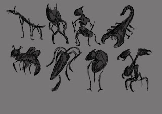
For
my silhouette concepts I used a standard brush with a medium opacity setting. I
did this because I could use the first layer of paint to create the overall
form of the insect and then use the darker greys from the brush to add a little
detail. Doing this also helped me remember the basic forms and a very rough
idea of the overall piece.
Once
I had picked the design I wanted I took the basic layout of the insect and
started to change aspects of it such a the shape of its legs, arms, head, eyes,
and even the way it carries it satchel. The insect is supposed to be some form
of fly catcher were it uses its one long arm to extend out and catch prey then
putting it into the satchel it carries.
Before I started my final piece I drew a quick silhouette drawing of my insect and done a quick colour variation sheet. I did this as although I had a pretty clear idea of what my final would look like I wanted to show variation and possibly find a new different design that I liked. I would have liked to a few more variations but with time management that was not possible. I used basic colours as these could be expanded into a much broader range in tone and shading.
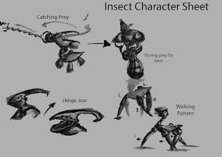
Once
I had a better understanding of what my insect looked like, I took that design
and used it to show its characteristics; such as how it walks, hunts, and opens
and closes its jaw. I also realised I didn’t like my original idea of how to
caught prey and changed it from instead of a simply long arm it was now had
multiple sections
which
extended out. I found it interesting being able to start with just a silhouette
and take it this far. The character sheet I feel shows all the things that is
needed to know about my concept.
I found that drawing out my final illustration to be quite difficult; at first I hadn’t used Photoshop much before this course was set and because of that, my first attempt at drawing out my illustration was quite different to the way I imagined it. The body looked to metallic and just seemed rushed and hadn’t had much time put into it. The colours I had used didn’t seem to blend to well and as well as now looking like a metal outer shell rather then an exoskeleton.
My second attempt came out much better, as I used a wider variety of brushes and colours. The body now looked how I imagined it to be having more of a green exoskeleton with the spine and bottom half of the legs being the only parts visible underneath. I also used reds and oranges for the eyes to contrast against the green armour. For this version I used a dark charcoal type brush to create a silhouette with a slight depth to it, and then used low opacity colours to slowly build up the colour giving me a lot more control then before.
I
found the same problem when starting to create the background/environment in
which my insect inhabits. After experimenting with a number of brushes however
I was able to find what worked best and am now happy with how my concept came
out. I used a series of brushes that looked like leaves to create the foliage
and used rock like brushes to create the earth and found these brushes to work
very well in creating depth. I would have liked to be able to learn more about
making the foreground match to the background, although being a simplistic
concept I found it very difficult to do so and would like to further look into
how I would be able to achieve this; saying all this though I am happy with the
end result I was able to create.


No comments:
Post a Comment